Inline risk · Updates instantly as you answer · 14 sec
MontyCloud's MSP customers ran AWS Well-Architected Reviews to claim $5,000 AWS credits per assessment, but the WAFR interface had no risk information tied to each best-practice check. Architects were tracking risk across 57 questions in spreadsheets, scanning rows manually for 8–12 minutes to find a single high-risk issue. In two years, zero MSPs had successfully claimed credits through the platform.
I led the redesign of the WAFR Review workflow, first as a 14-day sprint shipping question-level tracking, then by reframing the whole live-assessment experience around inline risk intelligence. The thesis: in cybersecurity workflows, augmenting expert decisions beats automating them.
Impact
· 6 months after launchBefore · 0 in 2 years
MSPs successfully claimed AWS credits
Before · 8–12 min
Time to identify high-risk issues
Before · 34%
Assessment completion rate
Before · 23 / mo
Support tickets tagged 'WAFR confusion'
The broken workflow
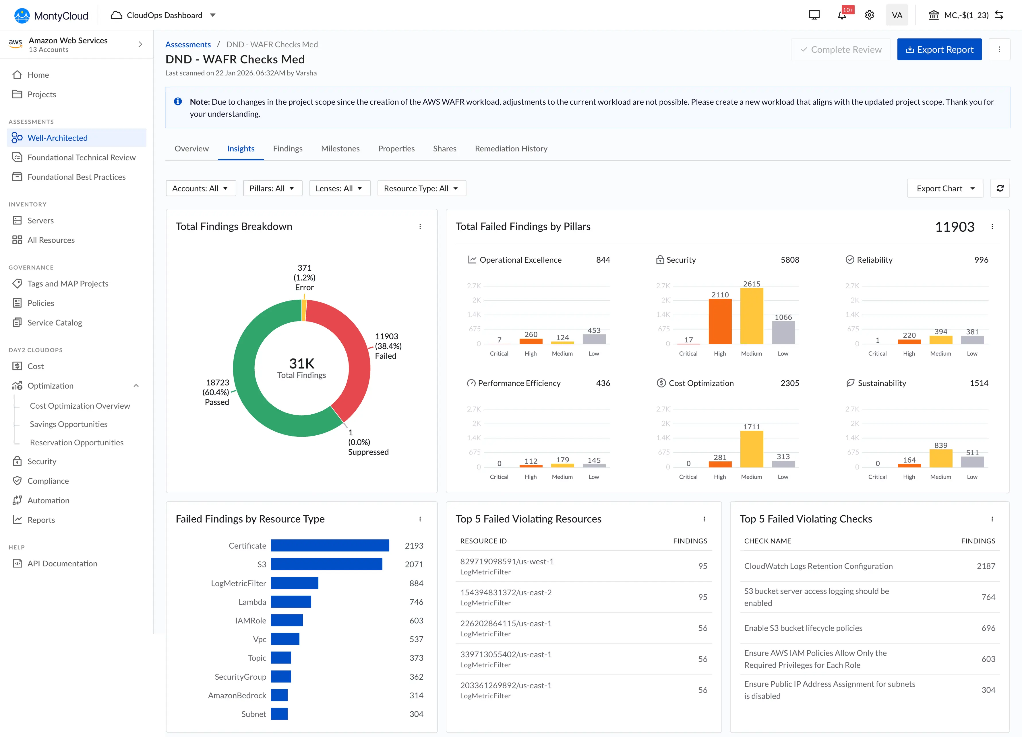
MontyCloud's AWS Well-Architected Review platform was used by Managed Service Providers (MSPs) and cloud-operations teams to assess customer environments against AWS best practices. The platform produced findings, but the workflow looked like this:
- Architect answers a 57-question assessment.
- System generates findings in a separate view, disconnected from the questions.
- Architect manually cross-references each question against AWS best practice, severity, failed resource, and remediation guidance.
- Architect explains findings live to the customer, under time pressure, with 57 questions and dozens of findings open across screens.
AWS PLATFORM • DISCONNECTED FINDINGS, NO RISK FILTERING

The result, observed across seven facilitation sessions:
- Users didn't know the impact of their answers until later
- Findings were disconnected from questionnaire decisions
- Analysts manually mapped AWS risks to controls
- Large finding volumes made prioritization difficult
- Workshops became cognitively exhausting
Zero MSPs had ever successfully claimed AWS credits through the platform. Architects were maintaining shadow spreadsheets just to keep track of what they'd answered and what mattered.
Who it was for
Cloud Security / Solutions Architect
Primary- Runs customer WAFR assessments end-to-end
- Needs to identify risk quickly during live calls
- Must explain findings to customers in real time
- Works under time pressure with stakeholders watching
- Technical, but not deeply familiar with every AWS control
Sales Teams
Secondary- Need understandable risk explanations for customer-facing decks
- Need prioritization clarity to position remediation services
- Need faster onboarding and lower training burden
- Rely on the tool to be a sales-enablement asset, not a black box
I relied on workflow observation, stakeholder interviews, and review-session walkthroughs with cloud architects, the enterprise environment didn't permit broad usability testing, so deep observation of a small number of architects became the primary research method.
The design question
How might we help cloud architects understand risk implications faster during live assessment workflows: without overwhelming them with security complexity?
The path I explored and rejected
Before settling on a workflow redesign, I pushed hard on full automation, partly because it was the obvious "AI moment" answer, and partly because the PM was open to it. Here's why I cut it.
Option A: Auto-Evaluate & Prepopulate Recommendations
Why I cut it
- In cybersecurity, pure automation struggled with contextual correctness, auto-generated severity classifications often missed customer-specific architectural nuance, eroding trust the first time they were wrong.
- High business cost and engineering effort to build, validate, and maintain, the platform team didn't have the infrastructure or model-evaluation pipeline to ship it responsibly inside a quarter.
- It removed the architect from the loop in exactly the conversations where architects added the most customer value, which would have shrunk the platform's strategic position with MSPs.
The thesis: augmentation, not automation
In cybersecurity workflows, full automation can reduce trust and explainability. We focused on augmenting expert decision-making instead of replacing it.
That reframe, augmentation over automation: became the prioritization filter for every feature decision that followed. If a feature took judgment away from the architect, it was out. If it surfaced the right information at the right moment so the architect could decide faster, it was in.
What I designed
The redesign added an Inline Risk Intelligence layer across the existing WAFR workflow:
- Risk Exposure preview on every best-practice check, architects could see whether a specific answer would generate an HRI (High Risk Issue) or MRI (Medium Risk Issue) before submitting, closing the feedback loop that previously took hours.
- Linked findings for each best practice, eliminated the manual correlation step between findings view and questionnaire view.
- Unique findings grouping: collapsed dozens of repeating findings into clean, actionable issue groups.
- Risk-exposure filtering by pillar: filter the question list by Operational Excellence, Security, Reliability, Performance, Cost, or Sustainability.
- Live Coaching Module: surfaced talking points and remediation guidance inline during customer workshops, so the architect's explanation matched the platform's evidence.
- Risk exposure per question (the 14-day sprint piece): the first time the platform showed which best-practice answers would generate risk, giving MSPs the visibility they needed to demonstrate progress to AWS and claim the $5,000 credit.
Feature Overview

Live Coaching Module

The solution
The redesigned WAFR Checks interface, and the three design decisions that made it work.
Decision 1 · Risk filtering
I chose
I rejected
Why
Outcome
Decision 2 · Status indicators
I chose
I rejected
Why
Outcome
Decision 3 · Scope for the 14-day sprint
I chose
I rejected
Why
Outcome
Decision 4 · Live Coaching Module in the All-Findings table
I chose
I rejected
Why
Outcome
Live Coaching · In Action
Info Panel · Detailed Context
A note on attribution
The metrics at the top are real, but they're not all UX wins.
The jump from 0 to 16 credit claims isn't a design victory, the question-tracking interface made the workflow possible at all. Before this, MSPs literally could not claim credits through MontyCloud. They used spreadsheets or AWS's native tool. That number is capability impact.
The clearer UX signal is the completion rate going from ~34% to ~87%: that's people finishing a process they'd previously abandoned. That is design impact.
How I validated
- Stakeholder walkthroughs with PM, cloud architects
- Post-launch observation of three users to measure time-to-identify-high-risk
What I'd do differently
Push for analytics instrumentation from day one. The "under 1 minute" metric came from observing three users, not from proper Mixpanel events. I should have scoped tracking into the initial sprint so the impact story was data-backed, not observational.
What I learned
Augmentation beats automation in trust-critical workflows. Cybersecurity, healthcare, finance, anywhere the cost of being wrong is high, removing the expert from the loop destroys the product's positioning even when the automation works. The whole redesign hinged on holding that line.
Looking at nOps and AWS's native WAFR tool gave us validated patterns and saved days of exploration. The value wasn't inventing a new paradigm, it was executing well within proven patterns, then differentiating on the things that actually mattered (accessibility, cognitive load, filtering directness).
The room this happened in
MontyCloud · 2024

The work didn't happen in isolation. The PM relationship I keep coming back to in this case study, that's what made the icons conversation resolve in five minutes instead of five weeks. The engineering pair sat next to me and would tell me "we can't ship that in 14 days, but here's what we can ship" before I'd even finished sketching. The constraint felt collaborative, not adversarial. That's the part you can't put in a results strip.