Vision UI · Token architecture

Vision UI · Token architecture

MontyCloud had no design system. Engineers built UI from scratch for every feature, different buttons, different tables, different spacing. I built Vision UI over 3 months. It became the foundation for every feature that shipped after, made dark mode possible, and unblocked white-labeling on the roadmap.
Impact
· 3 months post-rolloutBefore · 3–4 rounds
Design QA cycles per feature
Before · Not possible
Dark mode, via a single token swap
Before · Not feasible
White-labeling, architecturally unblocked
Before · Ad-hoc
Annotated handoff mockups produced
Tokens, spacing, component states documented
The problem
I joined MontyCloud as one of the first two designers. No design system, no shared patterns, no component library, no tokens. Every feature had its own visual language.
What the product looked like:
Buttons looked different across pages. Tables, the most-used pattern for MSPs analyzing AWS data, were inconsistent in layout, filtering, and interaction. Colors were hardcoded. Spacing was ad-hoc. Dark mode didn't exist and couldn't exist without a token system.
Why this became urgent:
- Engineers were rebuilding UI components for every feature because nothing was reusable
- Design QA took 3–4 review cycles per feature, no shared reference for "correct"
- White-labeling was on the roadmap but architecturally impossible without tokens
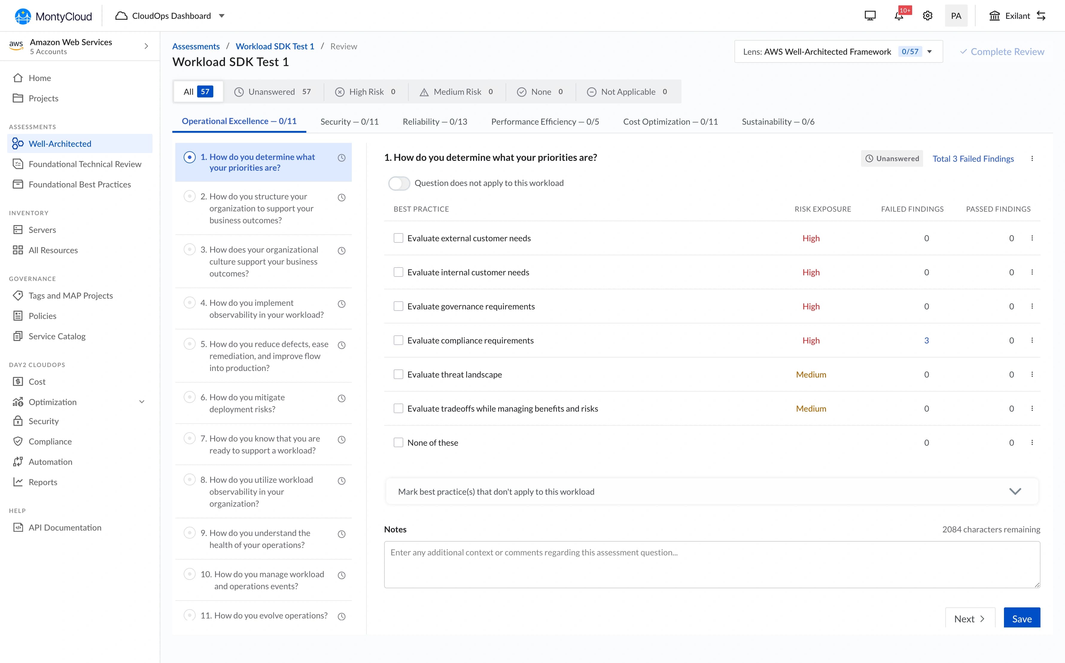
- MSPs spent most of their platform time in data tables, and every table worked differently
PM and Founder agreed: we needed a shared design language before we could ship reliably.
Research
I started by auditing what existed and studying what worked elsewhere.
I reviewed the full MontyCloud product (every page, every component pattern), 4 established design systems (Atlassian, IBM Carbon, Shadcn/ui, Preline), AG Grid documentation (already in engineering's stack), Radix UI (headless, accessible primitives), and customer feedback mentioning UI confusion from support tickets.
What the audit revealed: The inconsistency wasn't random, it was the natural result of different engineers building different features at different times with no shared reference. Each engineer made reasonable decisions in isolation. The problem was systemic, not individual.
The design question
How might we establish a shared visual foundation fast enough to ship alongside features: while building something durable enough to support theming, dark mode, and white-labeling the roadmap demanded?
The solution
Vision UI · Component library

Three phases over 3 months:
- Month 1: Core token system + foundational components
- Month 2: Table pattern + data-heavy components
- Month 3: Remaining components + legacy migration + composite pattern documentation
Decision 1 · Token architecture before component library
I chose
I rejected
Why
Outcome
Vision UI · Button system

Decision 2 · Table UX: persistent left-panel filter
I chose
I rejected
Why
Outcome
Vision UI · Table & filter pattern


Decision 3 · Adoption strategy: annotated mockups + office hours
I chose
I rejected
Why
Outcome
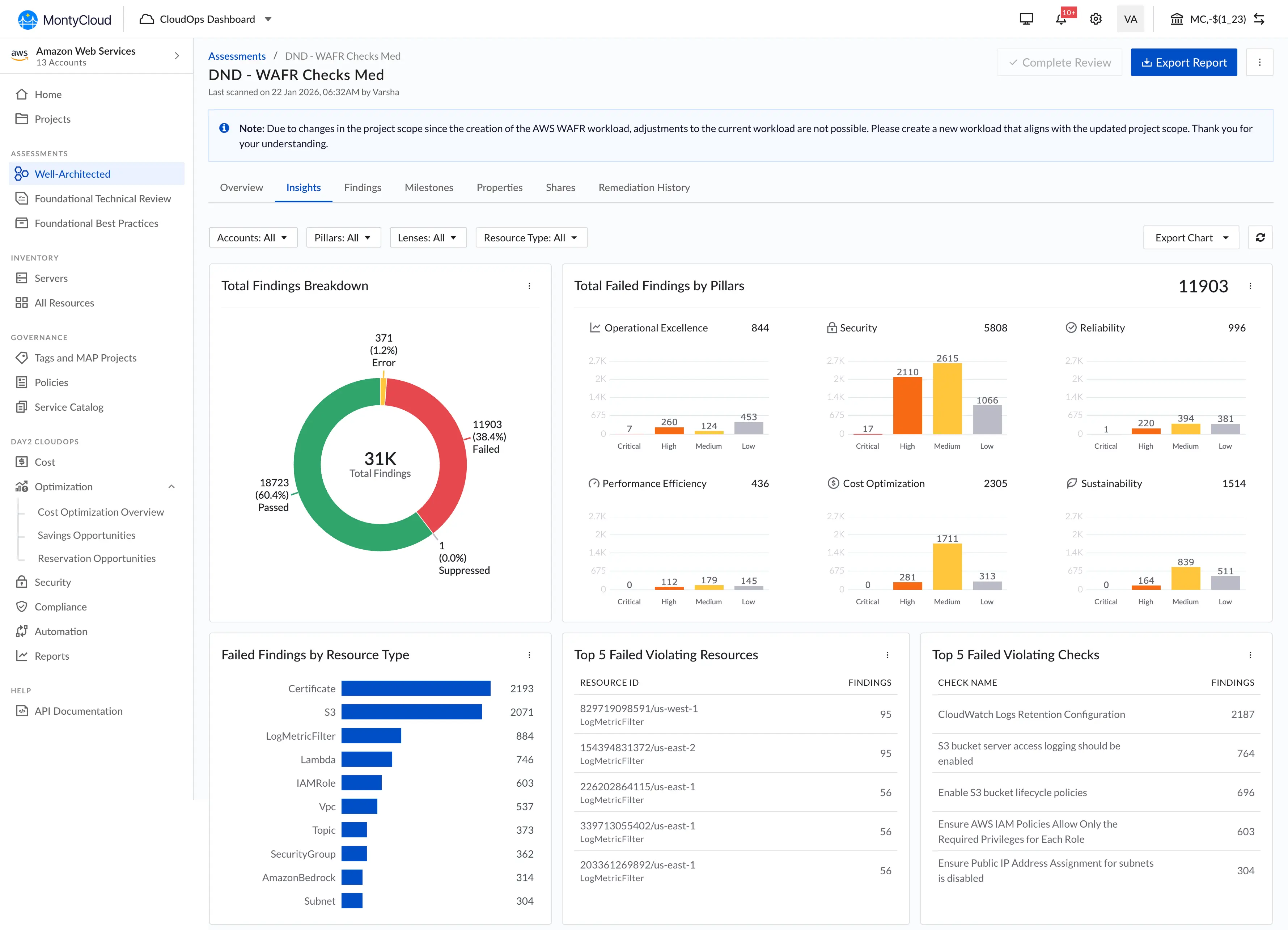
Built using Vision UI: Cost optimisation module

Built using Vision UI: Side panel

What I can say about outcomes
What I can say confidently:
- Design QA cycles dropped from 3-4 rounds to 1-2 rounds per feature
- New feature UI development became noticeably faster, engineers stopped rebuilding from scratch
- Dark mode shipped as a token swap, not a codebase rewrite
- White-labeling moved from "architecturally blocked" to "feasible"
- The other senior designer and I could move faster because we shared a component library in Figma
What I can't quantify precisely:
I don't have exact time-savings numbers. We didn't instrument "hours spent on UI implementation" before vs. after. The qualitative signal was strong, engineers and PM consistently said development was faster, and the QA reduction was visible in sprint velocity. But I won't attach specific figures to something I didn't measure.
"I can finally see my data and adjust filters without losing context.", MSP Customer
What didn't ship
Component playground: an interactive tool where engineers could configure components visually and copy the code. Scoped out because Storybook covered most of the need, and a custom playground wasn't justified for a team of ~8 engineers.
Motion/animation tokens: I established static visual tokens but not a motion system. Animations were handled ad-hoc per feature. This was fine for the MVP, consistent motion is a polish concern, not a foundation concern, but it meant animation quality varied.
Composite pattern documentation from day one: I documented individual components but not composite patterns: how they should work together in common layouts (form + table, sidebar + content). I added this in Month 3, but it should have been there from Month 1. Engineers could build correct buttons and still assemble them incorrectly.
What I'd do differently
Document composite patterns from day one. The gap between "correct button" and "correct page layout" was wider than I expected.
Push for analytics instrumentation. Without usage data, I had to rely on PM feedback and visual QA to know which components were misused. Real instrumentation would have told us which patterns needed more support earlier.
What I learned
A design system is an adoption problem, not a design problem. Building the system was the easier half. Getting engineers to use it consistently, that took annotated mockups, office hours, QA escalations, and sustained culture change. The system's value is zero if it sits in Storybook unused.
Tokens are boring and essential. Nobody gets excited about a spacing scale. But tokens made dark mode, theming, and white-labeling possible without rewriting CSS across the product. The boring infrastructure work enabled every interesting capability that came after.
MontyCloud Goa Meetup · 2024