Shipped · WAFR Insights Dashboard
MontyCloud had WAFR check execution, you could run an AWS audit and get a list of findings. But the results were raw data. No charts, no summaries, no way to present them to a client. MSPs were exporting CSVs and building PowerPoint decks from scratch. Four to six hours per client, every time.
I designed MontyCloud's first insights dashboard in 6 weeks. It became the feature sales cited in 12 of 28 closed deals in the quarter after launch.
Impact
· 3 months after launchBefore · ~5 hours
MSP report creation time, per client
Before · N/A
Adoption: 25 of 27 MSPs
First quarter post-launch
Before · Consistent complaints
Customer satisfaction on reporting
Qualitative signal, not a tracked metric
The problem
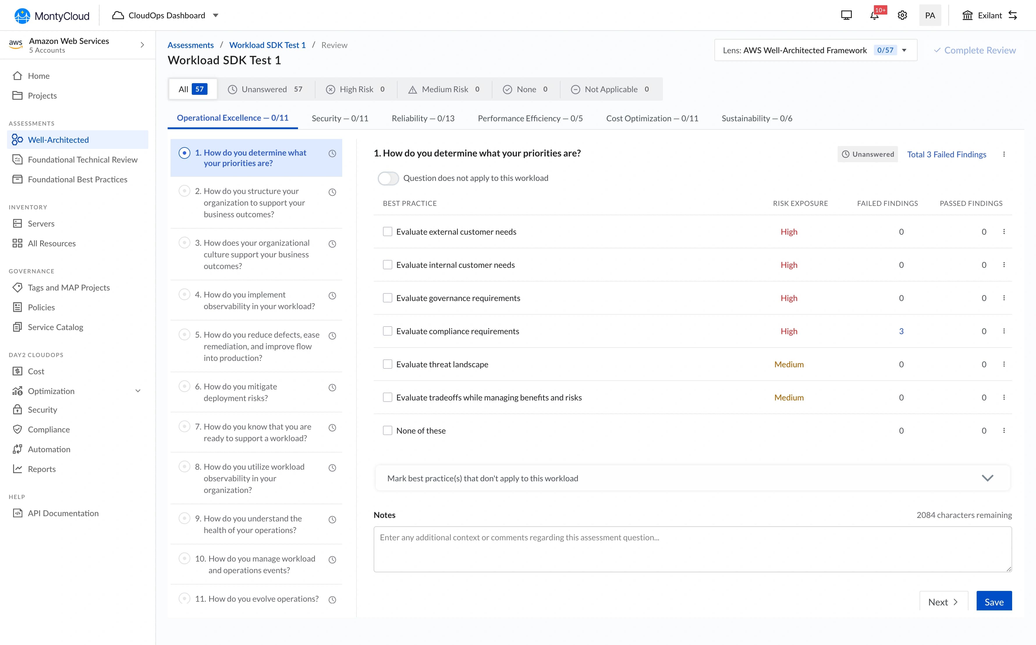
When MSPs ran a WAFR check on MontyCloud, they got a list of findings. That was it. No visualization, no summary, nothing presentable to a client.
What MSPs were actually doing:
- Exporting CSV data from the platform
- Building PowerPoint decks manually (4-6 hours per client, per quarter)
- Creating their own bar charts, donut charts, and "worst offender" lists from scratch
- Presenting these decks on client calls, in decks that looked different every time
The business signal:
- 18 of 27 prospects in Q2 2023 explicitly asked for visual reporting before closing
- Existing customers were threatening churn over the reporting burden
- Sales had nothing to demo, we had no reporting capability at all
PM and Founder came to me: "We need visual reporting for WAFR results. Can we build something?"
Who it was for
MSP Engineer / Solutions Architect
Primary- Runs WAFR assessments for multiple clients
- Needs to produce client-ready reports after each run
- Presents findings to non-technical stakeholders (CTOs, VPs)
- Currently spending hours per client on manual slide-building
MSP Business Owner / Account Manager
Secondary- Needs reporting output to demonstrate value to enterprise clients
- Wants competitive differentiation over manual audit workflows
- Not technically fluent, needs the dashboard to be immediately readable
Research method: I reviewed 8 PowerPoint decks collected from MSP customers, ran 2 direct interviews (45-minute calls), read 12 support tickets requesting reporting, and shadowed one live client presentation. The enterprise context made broader usability testing impractical.
The design question
How might we turn a 5-hour manual reporting workflow into something an MSP can produce and present in under an hour: without sacrificing the executive readability their clients need?
What I designed
The redesign was a dashboard, not a report. That distinction was a deliberate choice made early with PM.
A report lets users configure what they see. A dashboard decides for them, standardized visualizations, consistent chart types, one layout. I pushed for the dashboard model because:
- We were building from scratch with one developer in 6 weeks
- Customization would have tripled scope
- MSPs wanted speed and shareability, not pixel-perfect brand consistency
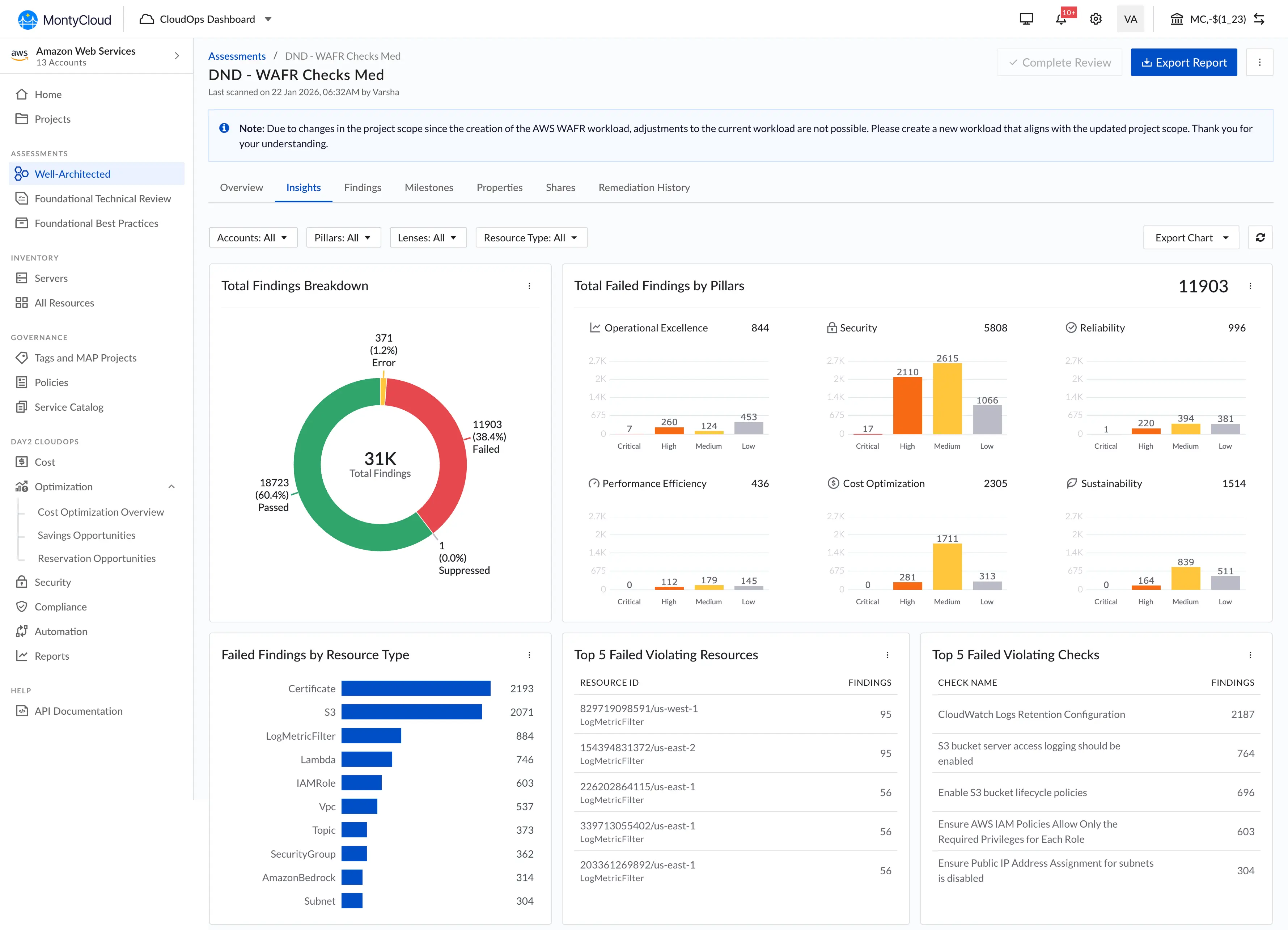
Six visualizations above the fold: bar charts by AWS pillar, donut chart for pass/fail split, top 5 violating resources, top 5 violating checks, breakdown by resource type, and interactive filtering that lets any chart segment filter the findings table below.
The solution
Decision 1 · No-scroll dashboard layout
I chose
I rejected
Why
Outcome
Decision 2 · Top violations: frequency over severity
I chose
I rejected
Why
Outcome
Decision 3 · Copy as PNG
I chose
I rejected
Why
Outcome
Decision 4 · Interactive filtering: additive, with explicit Clear All
I chose
I rejected
Why
Outcome
What the data showed
Adoption (3 months post-launch): 25 of 27 MSPs were using the dashboard. Report creation time dropped from ~5 hours to ~45 minutes per client.
Business context, with caveats: During the same 3-month period, deal closure rate went from 47% to 58% and customer churn decreased by 15%. Sales cited the dashboard in 12 of 28 closed deals.
I'm listing these numbers because they're real. But multiple factors contributed, pricing changes, market conditions, other product improvements. The dashboard was one variable, not the only one. The qualitative signal was stronger: sales consistently called it a competitive differentiator we hadn't had before, and 3 churning customers mentioned it as the reason they stayed.
"This dashboard transformed our client conversations. We went from explaining problems to discussing solutions.", MSP Customer
What I'd do differently
Test with MSPs' clients, not just MSPs. I optimized for the person building the report and never validated with the CTO or VP receiving it. We designed for the creator's workflow; the audience's needs were secondary. A client-facing "presentation mode" with larger fonts and simplified language would have served that audience better.
Push for analytics instrumentation. The "94% adoption" number came from manually polling MSPs through sales. We didn't have product analytics until Q3. Real usage data earlier would have told us about the anchoring behavior on Top 5 lists and prompted the "See all" links a quarter sooner.
What I learned
Enabling a workflow matters more than polishing an interface. The dashboard wasn't beautiful, standard charts, dense layout. But it replaced a 5-hour manual process with a 45-minute one. MSPs didn't care about visual polish; they cared that they could copy charts into their own decks.
The best feature solved a problem outside our product. Copy-as-PNG got higher adoption than interactive filtering. The most impactful thing I designed wasn't what users did in the dashboard, it was what they did after they left it. This shifted how I think about product boundaries.
Every decision at a 0-to-1 company sets precedent. The filter interaction I chose for this dashboard, additive, with visible chips and explicit clear, became the documented MontyCloud standard for the next 3 features. I didn't plan for that. It happened because there was nothing else to reference.
What shipped later · Trends over time

The trends chart, showing how failed findings decreased across multiple WAFR runs, didn't make the 6-week cut. It needed historical data storage we didn't have. We shipped it in Q4 once I understood from real usage data which time ranges mattered to MSPs and how they actually used historical data. That was different from what I'd originally assumed.