MontyCloud had no design system. Engineers built UI from scratch for every feature — different buttons, different tables, different spacing. I built Vision UI over 3 months. It became the foundation for every feature that shipped after.
Decisions at a Glance
| Decision | What I chose | What I rejected | Why |
|---|---|---|---|
| Starting point | Token architecture first | Component library first (faster to ship) | White-labeling was on the roadmap — without tokens, theming would mean rewriting every component. Tokens made theme swapping a variable change |
| Border radius | Sharp 2px across the system | Rounded corners (industry trend) | Deliberate enterprise aesthetic. MontyCloud's users are cloud engineers, not consumers. Sharp edges read as precise and technical |
| Table filtering | Persistent left-panel (260px) alongside table | Dropdown filters that hide when closed | Users lost context with dropdowns — filter, close, check table, reopen, adjust. Persistent panel eliminated the toggle loop |
| Adoption strategy | Annotated mockups + weekly office hours + visual QA reviews | Documentation-only handoff (Storybook) | Documentation alone wasn't enough. Engineers needed direct support. Spent more time on adoption than on actual design work |
| What I'd reconsider | Should have documented composite patterns from Phase 1, not just individual components. Should have started with the table pattern (highest user impact) instead of tokens (highest architectural impact) |
Context
I joined MontyCloud as one of the first two designers. Same day as the other senior designer. No design system, no shared patterns, no component library, no tokens.
What the product looked like:
Every feature had its own visual language. Buttons looked different across pages. Tables — the most-used UI pattern — were inconsistent in layout, filtering, and interaction. Colors were hardcoded. Spacing was ad-hoc. Dark mode didn't exist.
Why this became urgent:
- Engineers were rebuilding UI components for every feature because nothing was reusable
- Design QA took 3-4 review cycles per feature — no shared reference for "correct"
- White-labeling was on the roadmap, but the codebase couldn't support theming
- MSPs spent most of their platform time in data tables, and every table worked differently
PM and Founder agreed: we needed a shared design language before we could ship reliably.
Research
I started by auditing what existed and studying what worked elsewhere.
What I reviewed:
- The full MontyCloud product (every page, every component pattern)
- 4 established design systems: Atlassian Design System, IBM Carbon, Shadcn/ui, Preline
- AG Grid documentation (already in use by engineering, paid license)
- Radix UI component library (headless, accessible primitives)
- Customer feedback mentioning UI confusion (pulled from support tickets and PM notes)
What the audit revealed:
The inconsistency wasn't random — it was the natural result of different engineers building different features at different times with no shared reference. Each engineer made reasonable decisions in isolation. The problem was systemic, not individual.
What I learned from other systems:
Atlassian and Carbon showed how token architecture enables theming at scale. Shadcn showed how to pair Radix primitives with Tailwind without fighting either tool. These weren't novel insights — but studying the approaches helped me avoid reinventing decisions that were already solved.
Defining the approach with PM
PM's initial framing: "We need a component library so devs stop building things differently."
My push: "Components alone won't solve it. If we don't establish tokens — colors, spacing, typography as variables — we can't support theming or white-labeling later. And we'll just recreate inconsistency at the token level."
Constraints:
- ~3 months for phased rollout
- One other designer (sharing broader product work)
- No dedicated design systems engineer — frontend devs would consume what I built
- AG Grid already in use (couldn't replace it; had to design around it)
- No product analytics — couldn't measure baseline usage patterns
What we agreed on:
- Token-based architecture from day one (not retrofitted later)
- Radix UI for accessible primitives + Tailwind for styling
- Storybook for documentation and developer handoff
- Phased rollout: new features first, then migrate high-traffic pages, then legacy cleanup
Design decisions
1. Token architecture over component library
I could have built a component library — styled buttons, inputs, cards — and shipped faster. But tokens were the harder, more durable choice.
Why: The roadmap included white-labeling for enterprise MSP clients. Without tokens, theming would mean rewriting styles across every component. With tokens, it meant swapping a set of variables.
What I built:
- Color tokens: WCAG-compliant primary blue (derived from the logo), with orange reserved strictly for critical/destructive actions. Orange had been used as a secondary color — I changed that because it created false urgency across the UI.
- Spacing: 8px base unit system for consistent rhythm
- Typography: Reduced font weights for screen readability, standardized scale
- Border radius: Sharp 2px for enterprise aesthetic (deliberate choice against the rounded-everything trend)
- Full light/dark theme support via token swapping
Trade-off: Token architecture added complexity upfront. Engineers had to learn the token system before they could use components. I mitigated this with Storybook documentation, but the learning curve was real — the first two weeks had more questions than I anticipated.
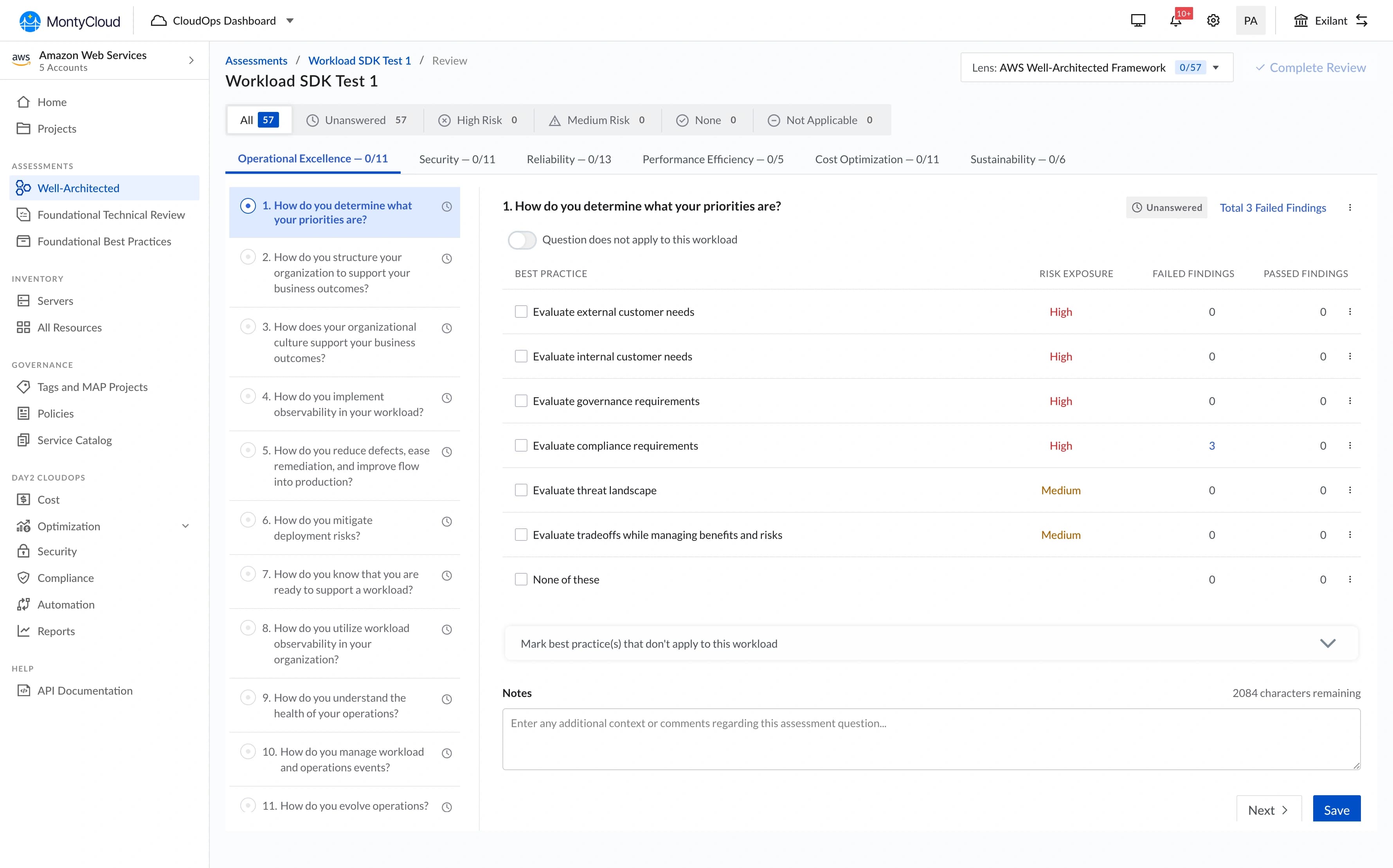
2. Table UX — left-panel filtering
Tables were the biggest UX problem. MSPs spend most of their platform time analyzing tabular data, and every table in the product worked differently.
The core issue (surfaced in PM syncs and support tickets):
Filters were hidden in dropdown menus on the right side. When users applied filters, the dropdown closed and they couldn't see what was active. They'd filter, lose context, re-open the dropdown to check, adjust, close, check the table again. Repetitive and disorienting.
What I designed:
A persistent left-panel filter that stays visible alongside the table. Users can manipulate filters and see results update simultaneously — no toggling, no hidden state.
Two decisions from testing, not intuition:
- Panel width: I initially designed a narrow panel (200px). In testing with PM, the filter labels were truncating. I widened to 260px, which meant less table width on smaller screens. Trade-off I accepted — filter legibility mattered more than an extra data column at 1280px.
- Collapse behavior: On screens below 1024px, the panel collapses to an icon that opens as an overlay. I tested keeping it always-visible on tablet, but it consumed too much horizontal space for the data to remain useful.
What changed: Design QA for table-related features dropped from 3-4 rounds to 1-2 rounds because there was now one correct table pattern to reference. I can't give a precise time savings number — we didn't instrument it — but the reduction in back-and-forth was noticeable within the first month.
"I can finally see my data and adjust filters without losing context." — MSP Customer
3. Storybook as the source of truth
No documentation existed. When I designed a component, the only handoff was a Figma file and a Slack message. Engineers interpreted designs differently, which created the QA cycles.
What I built:
- Component documentation with usage guidelines and code examples
- Interactive examples showing states (default, hover, active, disabled, error)
- Accessibility notes for each component (keyboard navigation, ARIA labels, screen reader behavior)
- Do/don't examples for common misuse patterns
What I got wrong: I built Storybook documentation for individual components but didn't document composite patterns — how components should work together in common layouts (form + table, sidebar + content, header + navigation). Engineers could build correct buttons but still assemble them incorrectly. I added pattern documentation in month 3, but it should have been there from the start.
4. Developer adoption — the actual hard part
Building the system was the easier half. Getting engineers to use it consistently was harder.
What worked:
- Annotated mockups (100+ across the rollout) showing exact token usage, not just visual specs
- Weekly office hours where engineers could ask questions and flag gaps
- Real-time Slack support during implementation
- Visual QA process: side-by-side comparisons of implementation vs. design
What didn't work initially:
Engineers weren't accustomed to pixel-level attention to spacing and alignment. The first few features built with Vision UI still had inconsistencies — correct components, wrong spacing. I escalated a few cases through PM to establish that design QA standards had changed. After 3-4 rounds of this, the team calibrated.
This wasn't a criticism of engineering — it was a culture shift. Previously, "close enough" was acceptable because there was no reference for "exact." Vision UI created that reference, and it took time for the workflow to adjust.
"At first, devs weren't used to paying attention to visual polish, but after a few reviews and escalations, the whole team leveled up." — My Reflection
What we shipped
Phase 1 (Month 1): Core token system + foundational components (buttons, inputs, selects, modals, badges). Applied only to new features.
Phase 2 (Month 2): Table pattern + data-heavy components. Migrated high-traffic existing features.
Phase 3 (Month 3): Remaining components, legacy page migration, pattern documentation.
| Component Area | What Shipped |
|---|---|
| Token System | Color, spacing, typography, border-radius, shadow tokens with light/dark themes |
| Foundational | Buttons, inputs, selects, checkboxes, radio, toggle, modal, badge, tooltip |
| Data Display | Table with left-panel filtering, cards, lists, stat blocks |
| Navigation | Tabs, sidebar, breadcrumbs, segmented controls |
| Feedback | Toast notifications, loading states, empty states, error states |
| Documentation | Storybook with usage guidelines, accessibility notes, code examples |
What changed
What I can say confidently:
- Design QA cycles dropped from 3-4 rounds to 1-2 rounds per feature
- New feature UI development became noticeably faster — engineers stopped rebuilding components from scratch
- Dark mode became possible (wasn't before)
- White-labeling became architecturally feasible (token swapping vs. codebase rewrite)
- The other senior designer and I could design faster because we had a shared component library in Figma
What I can't quantify precisely:
I don't have exact time-savings numbers. We didn't have instrumentation to measure "hours spent on UI implementation" before vs. after. The qualitative signal was strong — engineers and PM consistently said development was faster, and the reduction in QA back-and-forth was visible in our sprint velocity. But I won't attach specific dollar figures or percentage reductions to something I didn't measure.
Business context:
The design system enabled capabilities that didn't exist before — dark mode, theming, consistent table interactions. These became selling points in demos. Sales mentioned the "polished, consistent UI" in several enterprise conversations. But I can't isolate the system's contribution to deal outcomes from other product improvements happening simultaneously.
What didn't ship
Component playground
I designed an interactive playground where engineers could configure components visually and copy the code. Scoped out because Storybook covered most of the need, and building a custom playground wasn't justified for a team of ~8 engineers.
Automated design-to-code validation
A tool that would compare screenshots of implementations against Figma designs and flag discrepancies. Interesting idea, but the manual visual QA process was working well enough for our team size. This would matter more at scale.
Motion/animation tokens
I established static visual tokens but didn't create a motion system. Animations were handled ad-hoc per feature. In retrospect, this was fine for the MVP — consistent motion is a polish concern, not a foundation concern. But it meant animation quality varied across features.
What I'd do differently
If I had 2 more weeks:
- Document composite patterns from day one, not just individual components. The gap between "correct button" and "correct page layout" was wider than I expected.
If I could start over:
- Push for analytics instrumentation to measure actual usage patterns — which components were used most, which were misused, where engineers deviated from the system.
- Run formal usability testing on the table pattern with MSP customers, not just validate through PM feedback.
- Start with the table pattern, not the token system. Tokens were architecturally important, but the table redesign had the most immediate user impact. Shipping it first would have built momentum and executive buy-in faster.
What I learned
1. A design system is an adoption problem, not a design problem.
The hardest work wasn't designing tokens or components — it was getting engineers to use them consistently. The system's value is zero if it sits in Storybook unused. I spent more time on documentation, office hours, and QA reviews than on actual design work. That ratio surprised me, but it was the right allocation.
2. Tokens are boring and essential.
Nobody gets excited about a spacing scale or a color variable. But tokens are what make theming, dark mode, and white-labeling possible without rewriting CSS across the product. The boring infrastructure work enabled every interesting feature that came after.
3. Establishing patterns at a 0-to-1 company means every decision persists.
The filter interaction pattern I chose for tables, the 8px spacing grid, the 2px border radius — these became the default for every feature after. I designed them carefully, but I underestimated how long they'd persist. Some decisions I'd refine with more time (the border radius is probably too sharp for some contexts) became permanent because changing foundational tokens after adoption is expensive.
4. Design QA is where systems actually prove their value.
Before Vision UI, QA was subjective: "Does this look right?" After, it was objective: "Does this match the documented pattern?" That shift — from opinion-based to reference-based — reduced friction between design and engineering more than any individual component did.