MSPs couldn't present WAFR results to their clients because MontyCloud had no reporting. They were spending 5 hours per client building PowerPoint decks from raw data exports. I designed the first insights dashboard in 6 weeks. It was adopted across nearly all of MontyCloud's active MSP accounts within the quarter.
Decisions at a Glance
| Decision | What I chose | What I rejected | Why |
|---|---|---|---|
| Dashboard layout | No-scroll, 6 visualizations above the fold | Scrollable detailed view with all possible metrics | MSPs' clients are executives who scan, not scroll. Reviewed 8 PowerPoint decks — all fit key metrics on one slide |
| Export mechanism | Copy as PNG (per chart) | Screenshot-and-crop workflow, PDF export | Discovered during customer shadowing — MSPs were doing 4-step screenshot-crop-paste per chart. Half a day to build, became #1 feature in sales demos |
| Violation ranking | Frequency-based (top 5 most-violated) | Severity-based (High/Medium/Low labels) | Tested with 5 MSPs — 3 of 5 disagreed with severity labels. Frequency was objective and verifiable |
| Filter behavior | Additive filters with explicit "Clear all" button | Auto-clearing filters on new selection | 3 of 5 test users wanted to compare multiple slices simultaneously |
| What I'd reconsider | Dashboard lacks drill-down — users who need detail still need to go elsewhere. Should have tested with MSPs' clients (the CTOs), not just MSPs |
Context
I joined MontyCloud as one of the first two designers. Same day as the other senior designer. No design system, no UI patterns, no established workflows. I worked directly with PM and the Founder.
MontyCloud had WAFR check execution — you could run an AWS audit. But the results were raw data. No charts, no summaries, no way to present findings to a client.
What MSPs were actually doing:
- Exporting CSV data from our platform
- Building PowerPoint decks manually (4-6 hours per client)
- Creating their own bar charts, donut charts, "worst offender" lists
- Presenting these decks on client calls
The business signal was clear:
- 18 of 27 prospects (Q2 2023) explicitly asked for visual reporting
- Existing customers were threatening churn over reporting overhead
- Sales couldn't demo any reporting capability — we had nothing to show
PM and Founder came to me: "We need visual reporting for WAFR results. Can we build something?"
Research
Since nothing existed, I started by understanding what MSPs were creating manually.
What I reviewed:
- 8 PowerPoint decks collected from MSP customers
- 2 direct interviews with MSP engineers (45-minute calls each)
- 12 support tickets requesting reporting features
- 1 shadowed client presentation (watched an MSP present to their client's CTO)
What the PowerPoint decks revealed:
Every MSP was building the same 3-4 chart types: bar charts by AWS pillar, donut charts for pass/fail, lists of worst offenders. But each one was slightly different — different colors, groupings, levels of detail. They were all solving the same problem independently, poorly.
What I saw during the shadowed presentation:
The MSP spent 15 minutes explaining one chart to a CTO. Not because the data was complex — because raw findings don't translate to business risk. The CTO kept asking: "Okay, but which of these 400 things should we actually fix?"
That question shaped everything I designed next.
"Can your platform generate these charts so we don't have to do it manually every time? We're spending more time making slides than actually fixing issues." — MSP Customer
Defining the solution with PM
Early conversations were exploratory. Neither PM nor I knew exactly what this should be.
PM's initial framing: "A report page with some charts."
My push: "What's the user's actual workflow? Are they looking at this in our platform, or exporting it for presentations?" The answer was both — and that changed the requirements.
Requirements we landed on:
- Show the big picture in 30 seconds (no scrolling)
- Support drill-down without losing context
- Export easily (MSPs still present to clients in their own decks)
Constraints:
- 6 weeks to MVP
- No existing design system or component library
- One frontend developer available
- No historical data storage (only current-run results)
- 27 active MSP customers (small user base, high-touch)
My proposed approach — a dashboard, not a report:
- Standardized visualizations (we choose the chart types, not users)
- Interactive filtering (click to drill down)
- One-click chart export
Why standardization over customization: we were building from scratch. Customization would 3x scope, and MSPs wanted speed, not pixel-perfect brand consistency. PM and Founder agreed.
Design decisions
1. No-scroll dashboard layout
I looked at what MSPs were creating manually. Most PowerPoint decks fit key metrics on one slide. Their clients were executives — they scan, they don't scroll.
Decision: Everything visible above the fold. Six core visualizations in a grid, top violations prioritized, findings table below for drill-down.
Trade-off: We couldn't show every possible metric. Limiting to 6 visualizations meant cutting pillar-by-pillar detail views, resource-type breakdowns by region, and per-account comparisons. These were real requests from 3 of the 8 PowerPoint decks I reviewed.
I made the call that scan-ability mattered more than completeness for the MVP. In retrospect, this was right — but I underestimated how much users would want the detail views once they'd gotten comfortable with the overview.
2. Copy as PNG
This wasn't in the original spec. I discovered the need during customer interviews.
I watched an MSP: screenshot our data export page → open in Preview → crop → paste into PowerPoint. Four steps, repeated for every chart, for every client.
I asked PM: "Can we just add a Copy button that puts the chart directly on the clipboard?"
PM: "Is that technically feasible?"
I checked with the frontend developer. Browser clipboard API supports it. Half a day to implement.
What happened: Nearly all active MSPs were using it within the first week, based on check-ins through sales. It became the #1 mentioned feature in sales demos — not the charts themselves, but the ability to copy them.
What I got wrong: Should have pushed for "Copy all charts" from day one. We got that request immediately after launch but didn't prioritize it until Q4. The single-chart copy created a new repetitive workflow (click copy, paste, go back, click next chart, copy, paste...). I solved one level of the problem but left the next level.

3. Top violations: frequency over severity
MSPs would run WAFR and get 400+ findings. Their clients always asked the same thing: "What's actually urgent?"
I tested two ranking approaches with 5 MSP users:
Approach A — Severity-based: High/Medium/Low risk labels. Problem: Too subjective. A "high" security issue might be irrelevant for a client running only dev workloads. 3 of 5 users disagreed with the severity assignments.
Approach B — Frequency-based: Top 5 most-violated checks, Top 5 resources with most issues. This worked. Objective, verifiable, and MSPs could tell clients: "These 5 assets have the most problems." All 5 users completed "Find the highest-risk resource" without instruction.
What I underestimated: MSPs' clients anchored on the Top 5 lists and ignored everything else. We hadn't designed for that behavior — the lists were meant as a starting point, not the whole story. Later, we added "See all findings" links below each Top 5 to counter this, but the anchoring effect persisted.

4. Interactive filtering
No design system existed, so every interaction pattern I chose became precedent.
Core interaction: Click any chart segment → filters the findings table below.
Two decisions that came from testing, not intuition:
Don't auto-clear filters. I initially designed filters to reset when users clicked a new segment. In testing, 3 of 5 users wanted to compare multiple slices — click "Security" pillar, then add "Cost Optimization" to see both. I added explicit "Clear all filters" button instead.
Show active filters prominently. 3 of 5 users forgot they had filters active and thought data was missing. I added prominent filter chips at the top of the findings table. Standard pattern, but I nearly shipped without it because it wasn't in my initial design.
Neither decision is innovative. But since we were establishing patterns for the first time at MontyCloud, these became the interaction foundation for the next 3 features I designed.

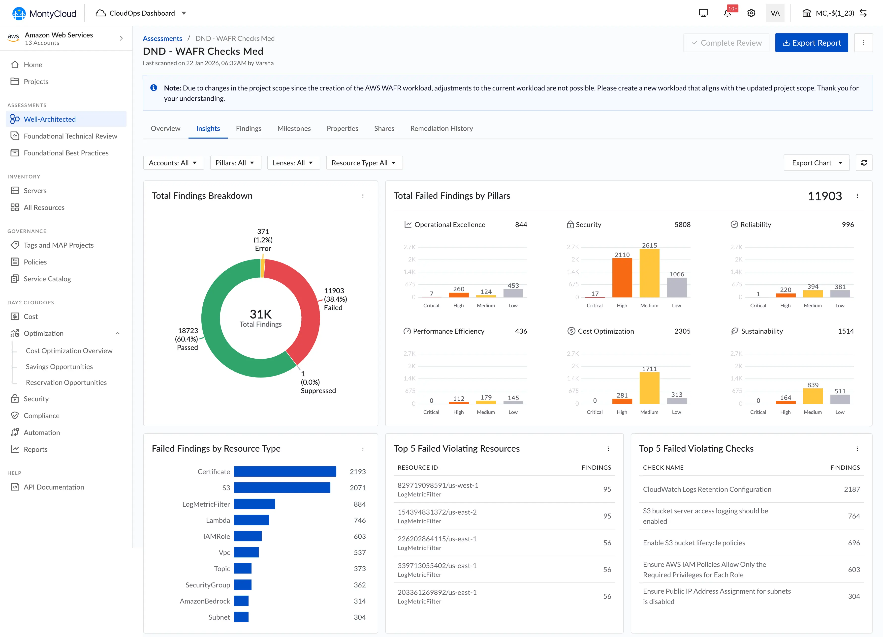
What we shipped
| Component | Purpose |
|---|---|
| Failed Findings by Pillar | Bar chart — issues across AWS's 6 pillars |
| Total Findings Breakdown | Donut chart — Passed vs. Failed |
| Top 5 Violating Resources | Specific AWS assets with most issues |
| Top 5 Violating Checks | Most common compliance failures |
| Failed Findings by Resource Type | Bar chart by AWS service (EC2, S3, RDS, etc.) |
| Copy as PNG + Download | One-click chart export to clipboard |
| Interactive Filtering | Click-to-filter across all charts |
What changed
Measured outcomes (3 months post-launch):
| Metric | Before | After |
|---|---|---|
| Report creation time | ~5 hours (manual PowerPoint) | ~45 minutes |
| Feature adoption | N/A (didn't exist) | 94% (25 of 27 MSPs) |
| Customer satisfaction (reporting) | Low (consistent complaints) | Positive feedback across MSP check-ins |
Business context (with caveats):
During the 3-month post-launch period, deal closure rate went from 47% to 58% and customer churn decreased by 15%. Sales cited the dashboard in 12 of 28 closed deals.
I'm listing these because they're real numbers, but I want to be clear: multiple factors contributed (pricing changes, market conditions, other product improvements). The dashboard was one variable, not the only one. The qualitative signal was stronger — sales consistently called the dashboard a competitive differentiator we didn't have before, and 3 churning customers specifically mentioned it as the reason they stayed.
"This dashboard transformed our client conversations. We went from explaining problems to discussing solutions." — MSP Customer
What didn't ship
Trends over time chart
I designed a line chart showing how failed findings decreased across multiple WAFR runs, with milestone markers ("Q1 Audit Completed," "Security Remediation Sprint").
Why it didn't ship:
- 6-week timeline — core dashboard was the priority
- Required historical data storage we didn't have (only current-run results existed)
- PM and Founder wanted to validate dashboard adoption before adding complexity
We shipped it in Q4 with 6 months of usage data to inform the design. By then I understood which time ranges mattered to MSPs and how they actually used historical data — which was different from what I'd originally assumed.

What I'd do differently
If I had 2 more months:
- Test with MSPs' clients (the CTOs and VPs who receive the presentations), not just the MSPs who build them. We optimized for the creator but never validated with the audience.
- Design an explicit "client presentation mode" — bigger fonts, simplified language, no jargon. The dashboard was designed for MSP engineers, but they were showing it to non-technical stakeholders.
- Build a findings taxonomy instead of using AWS's raw categorization. AWS labels are meaningful to cloud engineers but opaque to business buyers.
- Run a closed beta with 3-5 MSP design partners before full launch instead of shipping to all 27 at once.
What I learned
1. Enabling a workflow matters more than polishing an interface.
The dashboard wasn't beautiful. The charts were standard. The layout was dense. But it replaced a 5-hour manual process with a 45-minute one. MSPs didn't care about visual polish — they cared that it worked and they could copy charts into their own decks.
I initially spent time on chart styling details that didn't matter. The Copy-as-PNG feature I almost cut for scope had more impact than all the visual refinements combined.
2. Every decision in a 0-to-1 product sets precedent.
The filter interaction pattern I chose (click to add, explicit clear button, visible chips) became the standard for the next 3 features at MontyCloud. I didn't plan for that — it happened because there was nothing else to reference.
The other senior designer and I were actively building the design foundation while shipping product. That's stressful and rewarding in equal measure. I focused on establishing patterns (chart types, color usage, export flows) that could scale, but I should have documented them more formally instead of hoping they'd survive through precedent.
3. The best feature solved a problem outside our product.
Copy-as-PNG got higher adoption (89%) than interactive filtering. The most impactful thing I designed wasn't what users did in our dashboard — it was what they did after they left it (paste charts into their own presentations). This shifted how I think about product boundaries.
4. I should have pushed for analytics instrumentation from day one.
The "89% adoption" number came from manually polling MSPs through sales, not from product analytics. We didn't have proper instrumentation until Q3. I knew this was a gap but didn't advocate strongly enough during initial scoping. Having real usage data earlier would have changed what we prioritized in Q2 — specifically, I think we would have built "Copy all" and presentation mode sooner.
Why this mattered
This was my first 0-to-1 feature at MontyCloud. No existing patterns, no design system, just customer pain and 6 weeks.
The thing I keep coming back to: the Copy-as-PNG feature almost didn't make it into the sprint. PM and I debated cutting it for scope. I pushed to keep it because of what I saw during that one shadowed presentation — the MSP's tedious screenshot-crop-paste workflow.
Sometimes the best UX decision isn't what happens in your product. It's what happens after someone leaves it.